

2025 / Web Design / Website
Improving Quilly's Value Communication
ROLE
Website Designer
TEAM
4 Designers
TOOLS
Figma, Adobe Illustrator
DURATION
August - October 2025 (12 Weeks)
Context
A Rebrand for Real-World Community
Quilly is an early-stage startup building an app that fosters a virtual living-learning community, helping college students form real-world connections and reduce loneliness at scale.
In August 2025, Quilly underwent a comprehensive rebrand across its app, website, and social media platforms. To define the new direction, the team and I explored Quilly’s origins, drawing inspiration from early internet communities—to create a flexible identity designed to evolve across the web. The visual language emphasizes creativity and playfulness while evoking a sense of nostalgia.
As part of the rebrand, we also rebuilt Quilly’s website with a stronger focus on user engagement and growth.
The Problem
Quilly’s previous website struggled to engage users and did not clearly communicate the company’s mission or values.
Quilly’s original website suffered from many issues.
Problem #1

Dull Visual Identity
Muted color palettes did not reflect Quilly's vibrant identity.
Problem #2

Flat, static layouts
Still visual assets were not engaging to visitors.
Problem #3

Poor Value Communication
Copy and assets failed to commumicate Quilly's mission and vlaues.
Key Insights
Misaligned visual tone
The muted, dusty color palette combined with dark, low-contrast photography made the previous website feel flat and visually uninviting. The lack of visual contrast and expressive imagery also made it harder for key content to stand out, contributing to lower engagement and a weaker emotional connection with users.
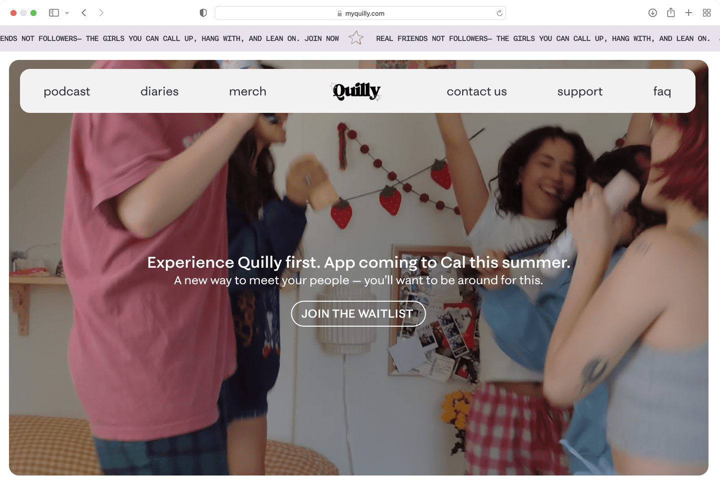
FIG. 1
Old Website Hero
Ambiguous information
Quilly's old website relied on vague calls to action and overly abstract statements, leaving users unsure of how Quilly actually worked or what steps to take next.


Does not answer the question "What is Quilly"
FIG. 2
Old Website Cards
The Solution
Creating a flexible design system
The team and I used this new design system to rebuild and redesign the website.

FIG. 3
Design System
Designing for engagement through motion
To address low engagement, we introduced motion and interactivity across key sections of the homepage. Interactions were purposefully designed to guide attention, establish visual hierarchy, and reinforce Quilly’s core messaging.
FIG. 4
Website Interaction Video #1
FIG. 5
Website Interaction Video #2
FIG. 6
Website Interaction Video #3
Clarifying Quilly's missions and values
To ensure Quilly’s mission was immediately understood, we redesigned the About page and reworked key sections of the homepage to clearly communicate what the platform stands for. Updated copy establishes a concise, consistent narrative, while supporting visuals and assets were intentionally aligned with the messaging.
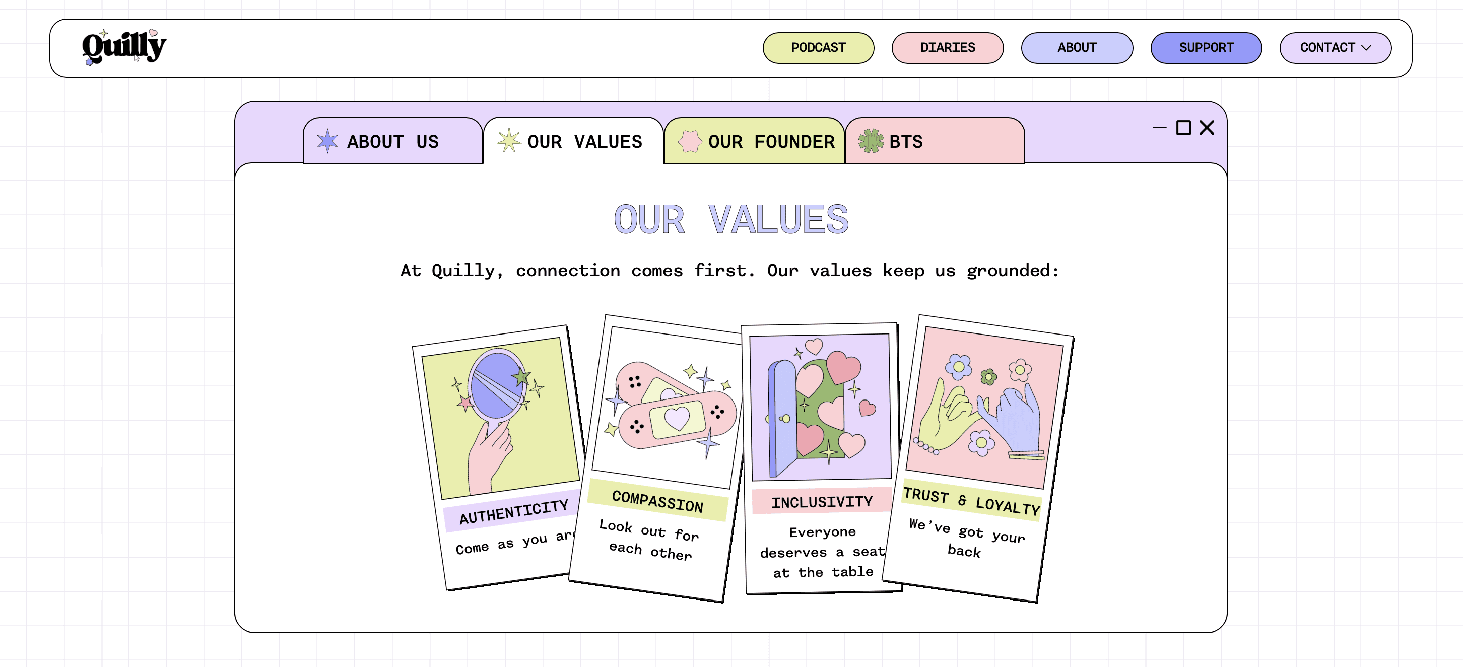
FIG. 7
Quilly Values
Centralizing resources and reinforcing values
To ensure Quilly’s mission was immediately understood, we redesigned the About page and reworked key sections of the homepage to clearly communicate what the platform stands for. Updated copy establishes a concise, consistent narrative, while supporting visuals and assets were intentionally aligned with the messaging.
FIG. 8
Quilly Resource Hub
The Full Design Process
There's a lot more to see behind the scenes!
Want to hear more about Quilly? I’m happy to chat more about my process over a call. Reach out to me at tranthaomy2017[at]gmail[dot]com!