

2025 / Product Design / Mobile App
Transforming UCLA Mobile Ordering
ROLE
Product Designer
TEAM
Just me!
TOOLS
Figma, Miro
DURATION
April - May 2024
The Problem
Mobile ordering is not equipped to field orders from UCLA's 20,000 students and workers
UCLA implemented a mobile ordering system in the summer of 2023 to replace its kiosks and in-person ordering. However, as students and workers alike have pointed out, not only has the app failed to address the long wait times, it has exacerbated the issue and introduced its own new set of problems.
The current UCLA mobile ordering system is overtaxed, inefficient, and outdated, negatively affecting students, workers, and restaurant bottom lines. As a UCLA student I took the opportunity to redesign the app to enhance my learning experience and challenge myself.
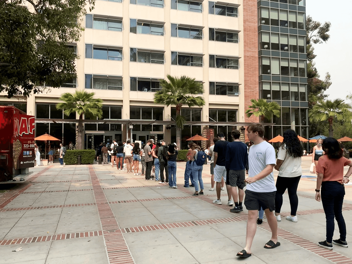
FIG. 0
mobile Ordering Lines in Front of Rendezvous West
The Solution
The goal is to redesign the UCLA mobile ordering app to improve interface issues as well as add load bearing features. The new system should allow workers breathing room for orders via consistent order releases while remaining accurate and efficient for students.

FIG. 1
Finished Screens
OUTCOMES
+39%
Improved user ratings of overall experience by 39%.
97%
97% of users found the redesigned ordering process easier and more intuitive to use.
User Research
Bruin perspectives on mobile ordering
To identify root causes of user pain points, I focused my research on UCLA students living on campus as well as workers at dining establishments that interact with the system on a day-to-day basis. I used a survey to get a general idea of attitudes towards the app along with high level statistics and conducted interviews with students and workers to flush out my research.
My perspective on mobile ordering
As a fellow Bruin and therefore frequent user of the app, I had accumulated many ideas for improvements based on my own experience. To move beyond personal bias, I used an affinity map to synthesize these ideas and identify recurring themes. This process surfaced three primary problem areas: poor information organization, long wait times, and frequent system failures. These insights directly informed the structure of my survey and interviews. Ultimately, the research revealed that the system lacks safeguards to prevent order buildup, leading to overtaxed workflows and breakdowns during peak usage.

FIG. 2
Old Website Cards
Surveys says (and interviews explains)
My survey was a Google Form consisting of eight questions with both multiple choice and short answers questions for students to explain their answers. I collected 18 responses. I also conducted in-depth inteviews to garner genuine user insights, capturing their emotions, desires, and challenges. I met with 4 individuals, two UCLA students, one UCLA student worker, and one UCLA dining manager.


FIG. 3
Example survey questions
User interview quotes
From this research and user quotes we were able to get a good feel of user's sentiments
"I wish I could cancel an order so I don't have to waste my swipe, but there isn't even an option to do that."
"It's ok if the food takes a while to be prepared, but I need an estimate that is at least somewhat accurate so that I can actually know what to do."
"It's not the biggest deal. I'm not worried about the meal swipe so much as I am about wasting food, and the fact that I contributed to the backup of the orders that is causing all these problems."
The numbers
94%
of participants surveyed wanted to see more of displays accurate and consistent wait times
78%
of participants surveyed wanted to be able to cancel their orders
61%
of participants surveyed wanted aesthetic changes made to the ordering process
Insights
From these statistics, I was able to clearly separate what I thought the users wanted from what the users actually wanted.
What I thought users wanted

Student ratings for Different items
Changes to the ordering process
What They actually wanted

Adding Estimated Wait times
Adding the Option to cancel your order
Better product displays
FIG. 4
Key insights into what users Actually wanted
Goals
Translating research into actionable goals and objectives
To identify root causes of user pain points, I focused my research on UCLA students living on campus as well as workers at dining establishments that interact with the system on a day-to-day basis. I used a survey to get a general idea of attitudes towards the app along with high level statistics and conducted interviews with students and workers to flush out my research.

Goal #1
Increase transparency between the kitchen and users
Ensure that mobile ordering is convenient and adaptable to all schedules.

Goal #2
Allow more flexibility in order placement
Provide clear, accessible information regarding the status of the kitchen.

Goal #1
Increase transparency between the kitchen and users
Implement quality of life features including pictures and descriptions to increase accessibility.
Ideation
Wireframe sketches
When sketching out my wireframes, I referred back to UCLA's original mobile ordering app as well as different food mobile ordering applications.

FIG. 5
Wireframe sketches
Information Architecture
Getting a clearer picture on the direction
While I am familiar with the structure of the ordering process, I wanted to ensure that my redesign covered all bases. Building out the information architecture helped me flush out which frames I needed to focus on most.

FIG. 6
Information architecture
Wireframes
Lo-fi wireframes
After identifying the changes I wanted to make in the structure of the app, I began wireframing with my objectives in mind.
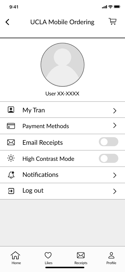

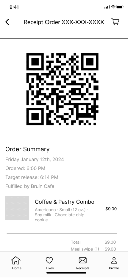

FIG. 7
Low-Fidelity Wirefames
From lo-fi to hi-fi
After testing the low-fidelity wireframes with a few friends, I refined the flows and incorporated improvements into the high-fidelity designs.
Improving browsability through structured navigation
Presenting all options on a single page required excessive scrolling, resulting in a heavy and cumbersome browsing experience. In the second iteration, customizations were moved to a dedicated page accessed by selecting a menu item. This approach aligns more closely with familiar mobile ordering patterns and significantly reduces unnecessary scrolling.
Long and Difficult

Segmented and organized
FIG. 8
Comparison of navigation between lo-fi and hi-fi iteration
Keeping it simple
The check-in and cancellation process was not intuitive. The original flow required students to “check in” before their order could be released, and cancellations were only allowed before that release window. While this structure was intended to give students flexibility while still supporting operational needs, test users found the check-in step confusing and struggled to understand the overall concept. In the new flow, students can still cancel their orders before the order is released but, they do not need to check-in.
Confusing Check-ins
Removed Check-ins
FIG. 10
Comparison of Check-ins between lo-fi and hi-fi iteration
Final Product
Allows more flexibility in order placement
The redesign features a cancellation option as well as options to schedule order pickups. This should decrease the overall load on the kitchen as students space out their orders and allow for students to adjust their schedules according to their responsibilities.
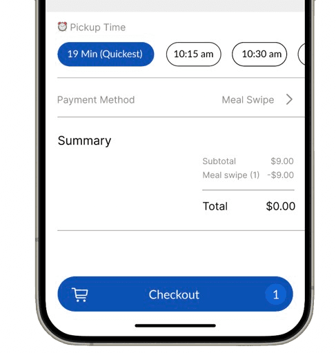
Option to choose a pickup time
FIG. 0
Final Checkout screen
Option to cancel Your order

FIG. 0
Final order card
Increases transparency between the kitchen and users
Wait times are clearly displayed throughout the ordering process so students know what to expect when it comes to ordering and the kitchen does not have to worry about rush orders.

Long and Difficult

Wait Times indicated
FIG. 0
mobile Ordering Lines in Front of Rendezvous West
Takes the guesswork out of the current user flow
Placeholders for pictures are integrated so that students know what to expect when they order and are able to make decisions that better suit their tastes. Additionally, added food descriptions highlight any potential allergens and sensitivities. Using a variety of symbols from UCLA's website. UCLA implements these symbols for their dining hall menus but not for their mobile ordering options.


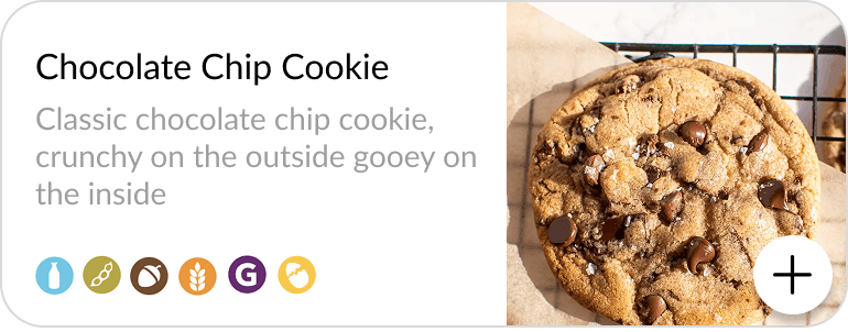
FIG. 0
mobile Ordering Lines in Front of Rendezvous West
Outcome
Following the redesign, the share of users rating the experience as “good” or better rose from 50% to 89%, marking a 39% increase.
97% of users also found the redesigned ordering flow easier and more intuitive to use.
Project Reflections
Challenges

Overthinking
The most complex solution isn’t always the best one (as seen with my original check-in system). While novel ideas can be exciting from a design perspective, they’re not always intuitive for users. Conventions exist for a reason and should be leveraged to create a more familiar, comfortable experience.
Staying flexible
Additionally, I learned not to get too attached to a specific design direction. Staying flexible allowed me to adapt the system as new insights emerged and make decisions based on usability, not personal preference.
What's next
A new system?
Early on, I explored completely reworking the ordering system with a check-in process to prevent orders from piling up or getting lost. While scheduling and cancellation features would help reduce congestion, I’m still curious whether a more efficient way to manage rush-hour crowds exists. It would likely require some modeling, but it could reveal smarter flow-management solutions.
The Full Design Process
There's a lot more to see behind the scenes!
Want to hear more about Quilly? I’m happy to chat more about my process over a call. Reach out to me at tranthaomy2017[at]gmail[dot]com!